A Statistical Look at the Stock Market, Part 3: Profitability of Industries and the Overall Market
- On an aggregate market value of $20.6T, MEI generated $1.23T in earnings, implying a market profit margin of 6% and a market P/E of 16.7.
- On an aggregate EV of $21.4T, MEIE generated $2.42T in EBITDA, implying a market EV/EBITDA of 8.83.
The question then becomes: which industries are contributing the most to market earnings? And how does market value correlate to industry earnings? We can look at this in terms of industry P/E ratios and graphs of total earnings vs. total price. For robustness I limit this analysis to industries with 8 or more companies because anything less and we greatly increase the chance of small sample bias.
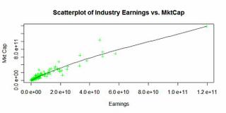
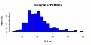
As expected, industry market cap is a positive function of the industry earnings. Let’s dig a little deeper into the actual numbers and pull up some names to see how these companies straddle the average P/E of 16. Below is a P/E histogram.
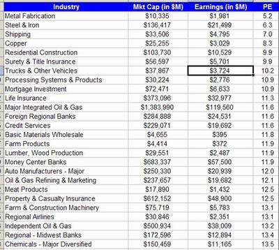
Because of issues with Blogger I am unable to post the full list of industries with their corresponding PE ratios, but below I will post some:
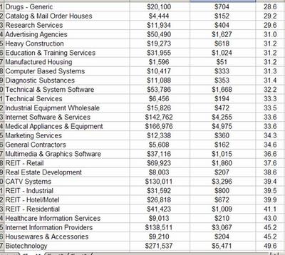
As expected, biotechs as an industry are very, very highly valued with an industry P/E of around 50.
Commodity-focused businesses seem cheap by P/E standards. Steel, copper, the tanker industry, oil and gas companies … all are at the bottom of the list.
REIT’s may seem on the expensive side but P/E probably isn’t the most relevant metric for that industry.
For those who are interested, I have the same information available on EV and EBITDA. Once I can incorporate how these metrics evolve over time, hopefully that’ll add another layer of depth to the analysis. And, of course, it would be interesting to see how mean reversion plays its hand. I will leave this for later.
posted by Dan McCarthy at
2:20 PM
![]()
![]()

0 Comments:
Post a Comment
<< Home